
The US, along with a small number of other countries, seems to have a much lower COVID fatality rate than others. Why?
Normally I try to post about stuff where I believe, however mistakenly, that I understand what is going on. In this case, however, I’m just plain mystified.
Kevin Drum Jones recently published this chart on COVID-19 mortality rates by country:
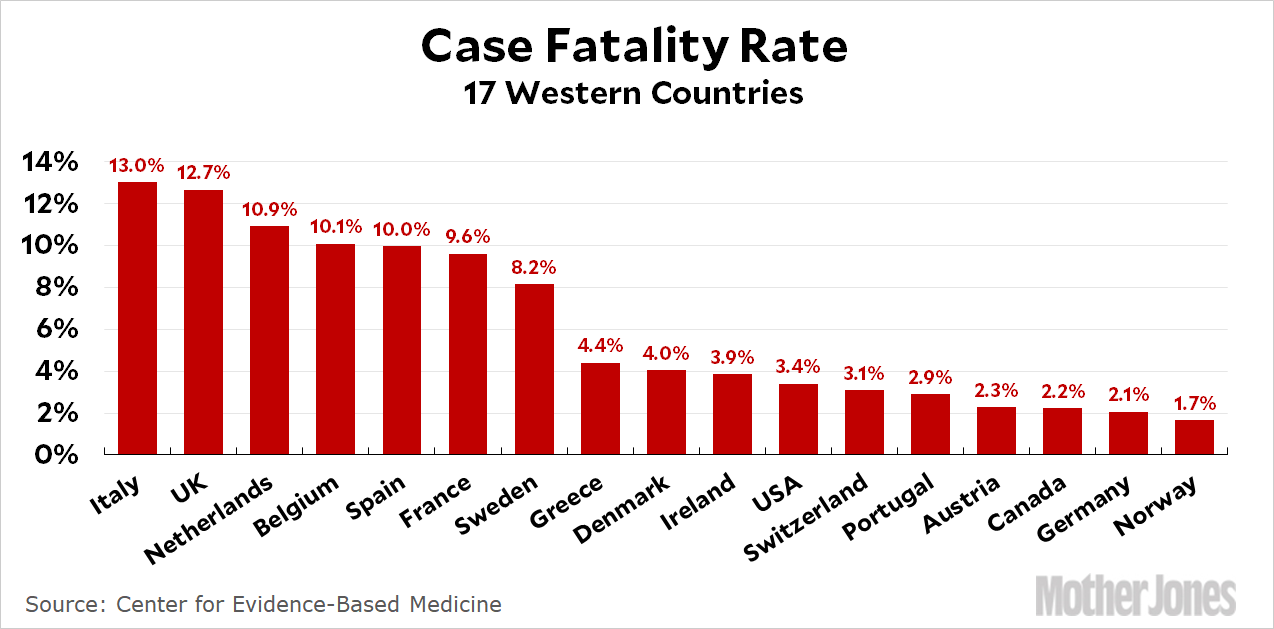 As Kevin says, The United States Has a Very Low COVID-19 Case Fatality Rate. And it’s kind of hard to figure out why.
Start with testing. The US has, at least until very recently, done quite a poor job of testing compared some other countries. But a failure to test would tend, on its own, to increase, not decrease, the reported mortality rate, since in general one assumes that the people not tested are either asymptomatic or mild cases, and thus don’t go in to crowded or inaccessible testing locations.
Nor is it easy to explain the national differences by failures in reporting coronavirus fatalities. There is no doubt that the US has vastly undercounted COVID deaths, not least in hotspots like New York City. Some of these are deaths at home which don’t result in testing. Others are deaths attributed to other causes. We know this is happening because the non-coronavirus death rates are soaring. (Update: More info on that in NYT.) On its own, this accounting failure would tend to lower the COVID death rate, which you might think would explain why the US rate looks lower than it ‘really’ is. The problem, though, is that there is no particular reason to think the US, much less all the countries on the right hand side of that chart above, have been undercounting any worse than, say, Italy or Spain, where we also have reason to believe there is a lot of undercounting going on. Maybe it will turn out their reporting systems were better than we think, but I kinda doubt it, especially in the case of Italy.
The differences don’t seem correlated with the quality of the health system, nor with whether it is centralized or decentralized. The US notoriously delivers poorer health outcomes — normally — than a number of the OECD countries. The Swiss do very well, but no so much the Portuguese, and the Greek health system is notoriously poor (on median, anyway).
Nor is overall national wealth a great predictor. There are richer and less-rich countries on both sides of the fatality-rate divide; all all industrialized and reasonably well off by international standards, but Portugal, Greece, and Ireland were all hurting economically (remember ‘PIGS’ in the debt crisis and post crisis-austerity?) a lot worse than many others on the list of higher fatality rates.
I wondered if, since poverty is a risk factor, whether Gini coefficients might explain something. Maybe countries with large pockets of poorer people are doing worse? But it looks like that’s not the explanation either:
| Low Reported COVID-19 Fatality Rate Country | Gini Coefficient | High Reported COVID-19 Fatality Rate Country | Gini Coefficient |
|---|---|---|---|
| Norway | 27.50 | Sweden | 29.20 |
| Germany | 31.70 | France | 32.70 |
| Canada | 34.00 | Spain | 36.20 |
| Austria | 30.50 | Belgium | 27.70 |
| Portugal | 35.50 | Netherlands | 28.20 |
| Switzerland | 32.30 | UK | 33.20 |
| USA | 41.50 | Italy | 35.40 |
| Ireland | 31.80 | ||
| Denmark | 28.20 | ||
| Greece | 36.00 | ||
| Average | 32.9 | Average | 31.8 |
| Average w/out USA | 31.9 |
Source: GINI index (World Bank estimate)
In the grand scheme of things the two numbers are close to equal, and in fact almost exactly equal if you throw out the USA as an outlier. So either way, that’s not it.
Of course, it may be that all our data is just so bad, or national reporting systems so different, that the whole question is, for the time being at least, futile. Who knows?
I’ll start with the same disclaimer as you, I have no idea. I am just guessing. But I am inclined to believe this might be about OVER-reporting on the left side of the graph. It is much more palatable to say “I’m sorry sir, your father died from coronavirus, a novel disease racing across the globe for which there is presently no good cure” than to say “I’m sorry sir, your father died from complications of something manageable/treatable under normal circumstances, but we used our limited resources on someone more attractive/younger/otherwise healthier and your dad got left behind.” And so, there is a default to label deaths as coronavirus fatalities unless it is absolutely clear that they weren’t coronavirus deaths. Following that guess a little further down the rabbit hole, cultural norms and the fine print of local laws might explain why this sort of thing could be happening more in some places than in others.
Same disclaimer here too. I will note four things: (1) the US may just be a couple of weeks behind other countries—we’re big and not all like NYC; it takes time for spread from hotspots to other states and cities—It may be more appropriate to compare data from weeks prior in EU to current data here. After all genetic testing suggests the NYC cases came from Italy so you would expect delays even for exponential growth to lead to high CFR. (2) IFR/CFR depends a lot on how overwhelmed the system is (compare Wuhan to Shanghai for example); (3) Similarly it may be most appropriate to compare US cities to EU cities. (4) IFR (Infecting Fatality Rate) will eventually be a much more reliable indicator than CFR. Stanford’s recent antibody testing in Santa Clara County suggested 48,000 to 81,000 people in the county have antibodies. There have been 73 deaths two weeks later which suggests an IFR of 0.09% to 0.15% which is low compared to other estimates I’ve seen (e.g. 0.5-0.6%). That supports the mystery.
By the way the Stanford data suggest that infections are 50-85x cases. Ouch!