
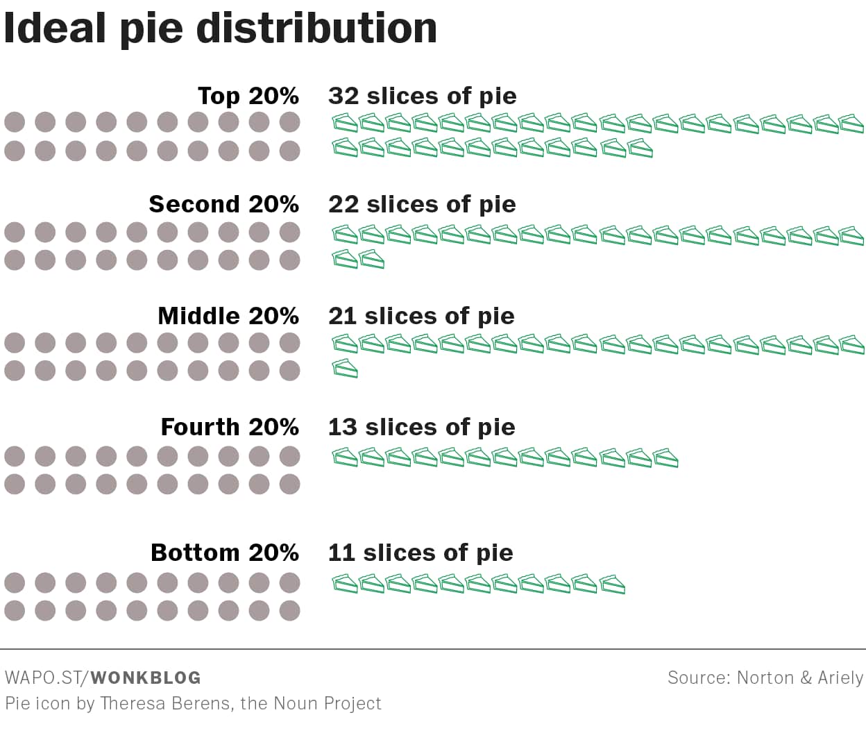
These pie charts come from the Washington Post Wonkblog. First there’s one symbolizing what US survey respondents said they though would be the ideal distribution of wealth:
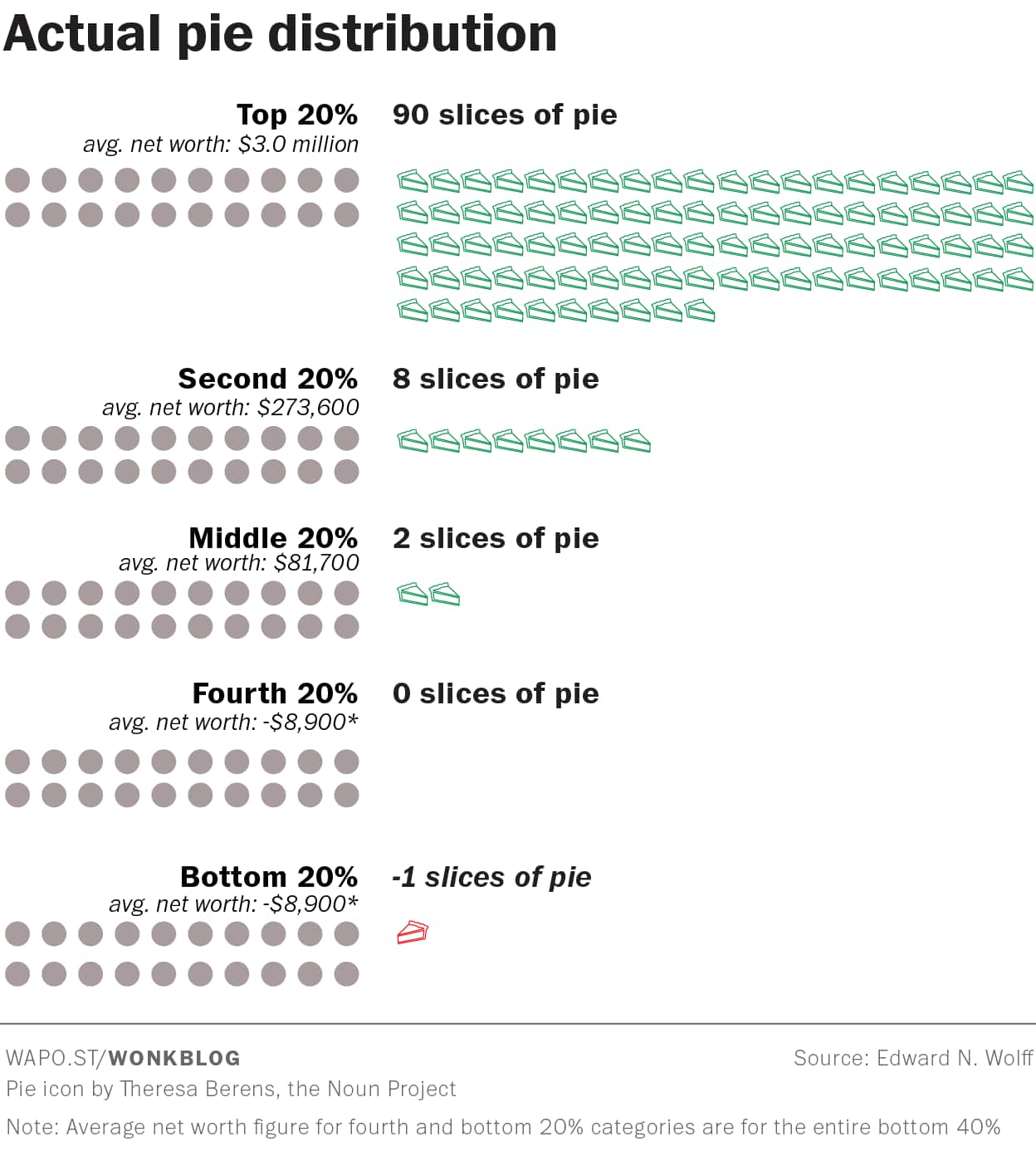
 But in fact we in the US have this distribution:
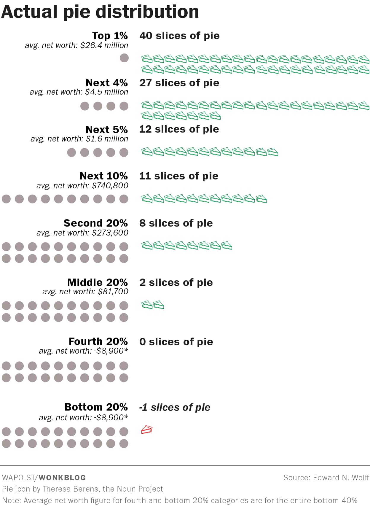
 Or, if you want to show just how skewed things are, you could represent it like this:
Of course the GOP tax plan being rammed through Congress will just make all this worse.
Myself, I think Herbert Stein’s law applies here (“Trends that can’t continue, won’t.”). Sooner or later there will be a reaction, or more accurately a counter-reaction. If we are lucky, it will be systemic and electoral and we’ll get a progressive government. If we are less fortunate, and we just get just Third Way types or more gridlock, there’s a risk the counter-reaction will be more revolutionary and more violent. (And I don’t mean that the top .1% will get pie in the face.)
I agree with your “trend” statement: Trump is definitely a “counter-reaction” to Obama….The pendulum will likely swing back–as it always does.